One developer is currently available to jump onto a project!
This Is How Our Engineers Build KMP Apps
This Is How Our Engineers Build CMP Apps
How I Would Prepare an Existing iOS App for iPhone Duo
If I were asked to prepare an existing iOS app for iPhone Duo, I would not begin by redesigning every screen for a foldable device.
I would begin by finding the assumptions the app already makes about screen size, navigation, state, and the usable display area. An application that is built around flexible layouts and standard iOS components may require less work than expected. An app with fixed dimensions, heavily customized navigation, or state tied too closely to individual views may need a more substantial review.
I work as an iOS engineer for more than ten years, and this is the main distinction I would want a product or engineering team to understand: preparing an existing iOS app for iPhone Duo is not primarily about creating another version of the interface. It is about making sure the existing application can continue working while its available space and physical configuration change.
In this article, I will explain the order in which I would review an existing application, the problems I would look for, and which parts I would test before estimating the required iPhone Duo development work.
Reviewing an existing app with your team?
Download our iPhone Duo Readiness Checklist to assess layout, navigation, state management, reserved regions, custom components, and testing risks in a structured format.
Download the iPhone Duo Readiness Checklist
I Would Start With the Existing App, Not With a New iPhone Duo Design
The first question would not be, “What new interface can we build for iPhone Duo?”
It would be, “How does the current app behave when its available space changes?”
iPhone Duo has an outer display, a larger inner display, multiple device poses, and support for running apps in different window sizes. The application can move from a relatively compact region to a much larger one while a person is using it. The usable space can also change when the device is partially folded or when another app shares the display.
Apple’s Human Interface Guidelines for iPhone Duo are based on a simple idea: developers should build an application that resizes and adapts to the space the system provides. That means using size classes, layout margins, safe areas, and adaptive containers instead of building around a fixed display width.
Before changing anything, I would run the current application through the relevant iPhone Duo configurations and document what happens. I would look for clipped content, empty areas, stretched components, misplaced controls, unexpected navigation changes, and any loss of state.
This first pass helps separate three types of screens:
- screens that already adapt correctly;
- screens that need a contained layout adjustment;
- screens whose structure or state management creates a larger engineering risk.
That distinction matters because an iPhone Duo compatibility project should not become an unnecessary redesign of the entire iOS application. The goal is to identify where the app already follows adaptive iOS patterns and where its existing architecture works against them.
Fixed Layout Assumptions Are the First Compatibility Risk
The first technical review would focus on resizability.
On a conventional iPhone, teams can get away with assumptions that appear harmless because the range of expected widths is relatively predictable. A view may use a fixed width, an offset may be tuned to one device family, or a custom component may assume that its parent will not change size while it is visible.
iPhone Duo makes those assumptions easier to expose.
I would review the SwiftUI and UIKit code for:
- hard-coded widths and heights that control the structure of a screen;
- manually calculated offsets based on a particular display size;
- direct use of screen bounds where container geometry should be used instead;
- custom layouts that do not respond correctly to size-class changes;
- overlays and floating controls anchored to fixed coordinates;
- views that only look correct in one orientation or aspect ratio;
- grids with column logic that breaks when the fold divides the available space.
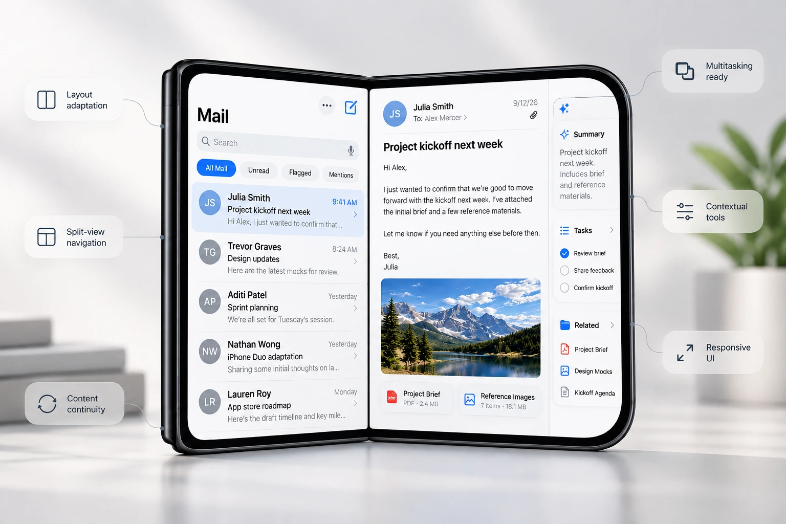
For example, imagine an order-management application with a list of orders and a separate order-details screen. On the outer display, the natural experience may be a single-column flow: users select an order and navigate to its details. On the larger inner display, the same hierarchy could be presented as a split view, with the order list on one side and the selected order on the other.
That does not mean the product needs two unrelated interfaces. It means the same information hierarchy can reveal an additional level when more space is available.
If the application already uses NavigationSplitView, UISplitViewController, adaptive SwiftUI layouts, or standard Auto Layout constraints, the system can handle part of this behavior. If the team has recreated these structures with custom frames and manual positioning, I would expect more development and testing work.
The most important outcome of this review is not a list of individual visual defects. It is an understanding of whether the app’s layout system is genuinely adaptive or whether it only happens to work on the devices tested so far.
State Must Survive Every Display and Layout Change
A layout can look correct and still provide a poor experience if the user loses context when the device changes configuration.
Apple treats folding, unfolding, and related display transitions as changes in available space and traits rather than as a reason to restart the application. The interface should adapt, but the user should still recognize the same app and continue the same task.
I would test what happens when a user:
- opens the device while completing a form;
- folds it while reading a selected item;
- changes configuration during a checkout or booking flow;
- moves between a compact list and a larger list-detail presentation;
- opens a sheet, alert, menu, or media view before the layout changes;
- switches between display configurations while data is loading.
Consider a banking app in which a user has entered transfer details but has not yet confirmed the transaction. If opening the device recreates the screen, clears the form, or triggers the request twice, that is not a cosmetic iPhone Duo issue. It is a state-management and architecture problem.
The state should not belong exclusively to a view that may be replaced when the layout changes. I would check where transient UI state, navigation state, and business-process state are stored, and whether the current architecture allows different presentations to use the same underlying state safely.
I would also distinguish an ordinary resize from a real scene disconnection. State that only needs to survive a change in layout can often remain in memory, while state that must survive scene recreation needs an appropriate restoration strategy.
For an enterprise iOS application, this review is especially important around workflows that create side effects: payments, approvals, uploads, bookings, signatures, or any operation that must not be submitted twice. A visually adaptive UI is not enough if configuration changes can duplicate work or leave the application in an ambiguous state.
I Would Preserve the Existing Information Hierarchy
One of the easiest mistakes would be to treat the larger inner display as permission to redesign the entire application.
I would avoid that unless the product already needs a broader redesign.
When a person opens iPhone Duo, the application should remain familiar. The same functions should be available, the current state should remain visible, and the main hierarchy should not suddenly change. More space can reveal more context, but it should not force the user to relearn the screen.
An email app provides a simple example. On the outer display, the user may move from a message list to an individual message. On the larger display, the app can retain the list and show the selected message beside it. The hierarchy is the same; the larger layout simply shows two levels at once.
I would apply the same reasoning to enterprise products:
- a project list can remain visible beside the selected project;
- a support queue can remain visible beside the current ticket;
- a document can remain visible beside its metadata or review controls;
- a dashboard can show additional detail without moving its primary actions;
- a field-service app can keep the work order visible beside a map or checklist.
This approach usually produces a more stable implementation than creating separate screen trees for each device pose. It also reduces the long-term maintenance cost because the team is adapting one product hierarchy rather than maintaining several versions of the same workflow.
Custom Navigation Would Be One of My Highest-Risk Areas
Standard system components are valuable on iPhone Duo because they already understand much of the platform behavior. Custom navigation is where I would slow down and inspect the implementation carefully.
The outer display has different proportions from a conventional iPhone, and Apple uses a vertical system layout for important navigation and toolbar controls. When an application uses NavigationStack, NavigationSplitView, UINavigationController, or UITabBarController, the system can perform much of the adaptation.
An application with a custom top bar, custom tab system, manually positioned toolbar, or bespoke gesture-based navigation may not receive the same behavior automatically.
I would check:
- whether custom bars consume too much of the available vertical space;
- whether navigation controls remain reachable and visible;
- whether content extends beneath camera or system regions;
- whether selected tabs and navigation paths survive resizing;
- whether custom transitions still work when the destination has a different size;
- whether modal presentations move away from unavailable regions;
- whether accessibility order still matches the visible interface.
This does not mean every custom component needs to be removed. It means the team must understand which responsibilities were taken away from the system when the component was customized.
That difference has a direct effect on the scope of an iPhone Duo adaptation. Two applications with a similar number of screens can require very different amounts of work if one relies on standard iOS containers and the other has a custom navigation framework spread throughout the codebase.
For companies evaluating this work, this is one reason a technical assessment should happen before a fixed delivery estimate. If you need help reviewing an existing architecture, our iOS app development team can join an established codebase, assess the risk, and support the implementation where additional native iOS expertise is needed.
I Would Audit Safe Areas and Reserved Regions Separately
iPhone developers already work with safe areas, but iPhone Duo adds physical regions that require more deliberate attention.
There are three areas I would include in the audit:
- The outer front-facing camera region, which is always present and can expand into the Dynamic Island for system activity.
- The inner camera region, which becomes relevant when that camera is active and changes the usable display area.
- The folding region, which can divide the inner display when the device is partially folded.
The folding region is particularly important for custom interfaces. A control can appear correctly when the device is flat and then become difficult to see or use when it moves into the curved area around the fold.
Imagine a trading application with a primary action button placed in the horizontal center of the expanded display. If the user partially folds the device and the button remains across the folding region, the most important action on the screen may become visually divided or difficult to tap.
Standard sheets, alerts, menus, toolbars, and system containers can adapt around these regions. Custom layouts may need to query the relevant reserved regions and make a controlled adjustment. In SwiftUI, the geometry proxy can provide reserved-region information; UIKit offers corresponding functionality through UIView.
My recommendation would be to move only what needs to move. I would not introduce dramatic layout changes whenever the folding region appears. If a two-pane layout can slightly adjust the width of each pane so that both remain visible, that is usually better than replacing the entire screen.
The same principle applies to grids. If a grid regularly presents four columns, the layout may be able to place two on each side of the fold. The goal is not to make the physical division disappear. It is to organize content so the division does not interrupt important information or interaction.

When Arrangement Views Add Real Product Value
Apple’s arrangement views provide a way to describe how two related views should organize themselves as the available area and reserved regions change. Apple demonstrates the behavior of reserved regions, displacement patterns, and split and overlay arrangements in its technical session, Strike a pose with adaptive layouts on iPhone Duo.
A split arrangement divides the available area between primary and secondary content. An overlay arrangement layers the views in one configuration and can move them into separate usable regions when the device is folded.
I would not add an arrangement view to every screen simply because the API exists. I would use it where two pieces of content already have a clear relationship and should remain available as the device changes.
Useful examples could include:
- a video or presentation on one side and its controls on the other;
- a document on one side and review comments on the other;
- a reference image on one side and an editing canvas on the other;
- a call or camera preview on one side and contextual information on the other;
- a primary workflow on one side and supporting details on the other.
For a standard settings screen or a simple form, introducing a special arrangement might add complexity without improving the experience. In those cases, a conventional adaptive layout may be the better engineering choice.
This is also where product judgment matters. iPhone Duo support should not become a collection of technical demonstrations. Any use of the additional display area should make the existing workflow clearer, faster, or easier to operate.
Preparing UIKit and SwiftUI Screens Requires Different Reviews
Many existing iOS applications are not written entirely in one UI framework. A production codebase may contain older UIKit screens, newer SwiftUI features, and custom components shared between them.
I would not assume the whole application needs to migrate to SwiftUI before supporting iPhone Duo. The right question is whether each screen responds correctly to changes in size, traits, safe areas, and reserved regions.
For SwiftUI screens, I would review:
- container-driven sizing and layout priorities;
- state ownership and view recreation;
NavigationStackandNavigationSplitViewbehavior;- geometry-dependent custom components;
- grid and arrangement behavior;
- sheets, overlays, and full-screen presentations.
For UIKit screens, I would review:
- Auto Layout constraints and content compression behavior;
- trait-collection changes;
UINavigationController,UITabBarController, andUISplitViewControllerbehavior;- assumptions tied to
UIScreenrather than the current window or container; - custom view-controller transitions;
- scene and state-restoration implementation.
The adaptation plan should follow the actual risk in the codebase, not a preference for rewriting mature screens in the newest framework. A stable UIKit screen built with adaptive constraints may require less work than a newer SwiftUI screen with fragile geometry calculations.
I Would Test User Journeys, Not Only Individual Screens
Screenshot review is useful, but it is not enough for an existing iOS app.
I would build a test matrix around complete user journeys and change the device configuration while those journeys are in progress. This is where teams discover whether layout, navigation, state, and business logic continue working together.
The test plan would include scenarios such as:
- starting on the outer display and opening the device mid-flow;
- moving from the inner display back to a compact configuration;
- partially folding the device while a modal or menu is open;
- activating the inner camera during a relevant workflow;
- changing size while a network request is running;
- resizing while video, audio, animation, or real-time data is active;
- entering text before and after the available geometry changes;
- using the app beside another application;
- restoring the same task after a real scene interruption.
For each scenario, I would check more than appearance:
- Is the same item still selected?
- Is entered data still present?
- Did the app duplicate a request?
- Are primary controls visible and reachable?
- Did content jump to an unexpected position?
- Is the accessibility order still correct?
- Are analytics events or business actions recorded more than once?
- Does performance remain acceptable while the UI reorganizes?
The most important workflows should be tested first. For a commerce app, that could be search, product selection, cart, checkout, and payment. For an enterprise workflow app, it could be reviewing a task, attaching a document, approving a request, and confirming that the action was submitted exactly once.
An application is not ready because every screen can technically render. It is ready when users can complete the workflows that matter without losing context or encountering new failure modes.
How I Would Estimate the iPhone Duo Development Scope
I would not estimate the project from the total number of screens alone.
I would group the work according to technical risk:
Low-risk adaptation
The app primarily uses standard Apple components, adaptive constraints, container-relative layouts, and well-separated state. Most work is likely to involve validation, small layout refinements, and additional test coverage.
Moderate adaptation
Several important screens contain fixed assumptions, custom navigation, or presentation logic that does not respond cleanly to size changes. The overall architecture is usable, but specific components need redesign or refactoring.
High-risk adaptation
Navigation and business state are tightly coupled to individual screens, important workflows depend on fixed geometry, or custom UI infrastructure replaces large parts of standard system behavior. In this case, supporting iPhone Duo may expose broader maintainability issues that should be addressed before the team commits to a release date.
The estimate should also separate:
- technical discovery and architecture review;
- design adaptation;
- SwiftUI and UIKit implementation;
- refactoring of shared or custom components;
- device and configuration testing;
- regression testing on existing iPhone models;
- release preparation and post-release monitoring.
This gives product and engineering leaders a more useful view of the work than a single estimate labelled “iPhone Duo support.” It also helps the team decide whether the required expertise already exists internally or whether an experienced enterprise mobile development partner should support the assessment or delivery.
Common Mistakes When Preparing an App for iPhone Duo
There are several approaches I would avoid.
I would not create a separate application architecture for every device pose. That would increase implementation and maintenance work without following the adaptive model Apple is encouraging.
I would not redesign the full product before testing the existing application. Some screens may already work correctly, and replacing them would add risk without solving a verified problem.
I would not assume that a successful launch in the simulator proves the app is ready. The team still needs to test complete workflows, transitions, state preservation, accessibility, performance, and behavior on the existing range of supported iPhones.
I would also not promise a timeline based only on mockups. The largest risks may sit underneath the interface, in state ownership, custom navigation, scene handling, side effects, or components that have accumulated device-specific assumptions over several years.
My Main Recommendation for Existing iOS Apps
If your application already adapts well, iPhone Duo may require less development than the hardware initially suggests.
If it does not adapt well, Duo will probably reveal problems that were already present: fixed layout assumptions, fragile state management, excessive custom navigation, or insufficient testing across different configurations.
That is why I would not begin by building an “iPhone Duo version” of the app. I would begin with a focused technical review of the existing codebase and its most important user journeys. From there, I would preserve what already works, refactor the components that create real risk, and use the larger display only where it improves the product.
The simplest way I would summarize the approach is this:
Do not build a separate app for iPhone Duo. Build an existing iOS app that can adapt reliably to the space and configuration the system gives it.
If you want to review your application internally first, download the checklist and use it with your iOS, product, design, and QA teams.
Assess Your Existing iOS App With Your Team
The iPhone Duo Readiness Checklist helps you review:
- layout and resizability;
- navigation and information hierarchy;
- state preservation;
- safe areas and reserved regions;
- custom UIKit and SwiftUI components;
- critical user journeys and testing coverage;
- technical risks that should be investigated before estimating delivery.
Download the iPhone Duo Readiness Checklist
If the review identifies architectural uncertainty, custom-component risks, or a gap in native iOS capacity, you can also contact Aetherius to discuss an iPhone Duo compatibility assessment or additional iOS development support.
to Build Your App?